a. Copy and open below link in a new tab. https://www.microsoft.com/en-us/download/details.aspx?id=58494
b. Click on Download.

c. Select the appropriate EXE file as per your system and Click on Next.
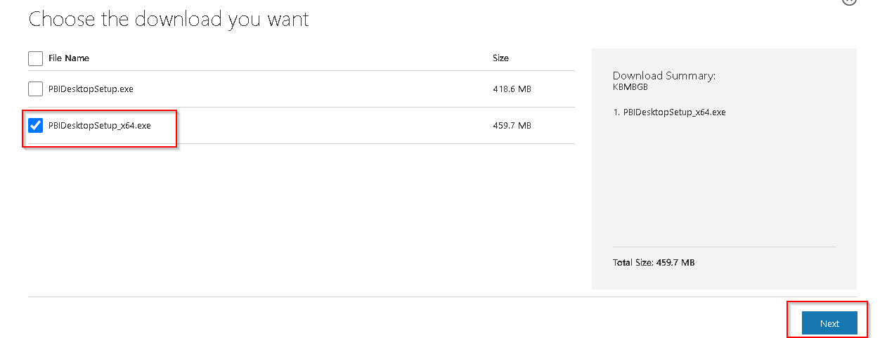
d. Once the .exe file is downloaded successfully then open it and complete the installation by opening it.
Selecting a visual you can see there is resize option on the border of visual, you can use that. Also for moving Visual from one place to another, you will see 3 dots after selection of visual, Click on that and drag your mouse by holding click continuously.
Select the visual. Then In Visualization pane 2nd Option is Format Your Visual Button. If you are not selected the visual then you will not able to see this button.
Like other tools you can use CTRL+Z for Undo
A KPI, or key performance indicator, is a metric you can use to monitor progress and define success. For example, a KPI for a salesperson in a company might be the amount of new business the person generated. A KPI in Power BI is a visualization the tool generates based on the parameters of the KPI.
The bar charts are used to compare the different data among different groups. Bar charts show the relationship with the help of two axes. On one axis it represents the categories and on another axis, it represents the discrete values. Over a period of time bar charts shows the major changes in available data.
A heat map is a data visualization technique that shows magnitude of a phenomenon as color in two dimensions. The variation in color may be by hue or intensity, giving obvious visual cues to the reader about how the phenomenon is clustered or varies over space.
A line chart is a graphical representation of an asset’s historical price action that connects a series of data points with a continuous line. This is the most basic type of chart used in finance, and it typically only depicts a security’s closing prices over time.
The matrix visual is Power BI’s version of the pivot table.
The ordinary table in Power BI is only two-dimensional. The data shown are flat and duplicate values are displayed, not aggregated.
A matrix table supports multiple dimensions, a stepped layout, aggregates data, and has a drill-down functionality.
Sparklines are tiny charts shown within cells of a table or matrix that make it easy to compare a large number of trends quickly. We can use sparklines to show trends in a series of values, (e.g., seasonal increases or decreases, economic cycles, or to highlight max and min values).
Power BI Card visual is used to display single values like Total sales, counts & single numbers in Power BI report page or dashboard. In other words, It is useful to display summary counts data, like Total sales, Total profit, Total discount etc. You cannot display multiples numbers in single card visual.
A stacked column chart consists of several vertically stacked series of columns, one after the other. The length of each series is determined by the value in each data point. Stacked column charts can show changes over time as it is easy to compare the length of the total columns.