Lab 2 – Visualize Your Data

After the data sets have been prepared for analytical consumption, the next logical step is to visualize the data leveraging any commonly available data visualization tool like PowerBI. This lab will help the student understand the power of data visualizations and teach them techniques to enable it.

Students will start this lab by importing the data as prepared in the previous lab into PowerBI They will then work through the steps to visualize these data sets in various charts and graph widgets available in PowerBI. They can also perform some pivoting and other quick analytical functions available in PowerBI. The students will have a PowerBI dashboard that will help them visualize the data in its full glory. An introduction to PowerBI would also be provided (for those unfamiliar with Microsoft PowerBI)

Table of Content
Frequently Asked Questions

a. Copy and open below link in a new tab. https://www.microsoft.com/en-us/download/details.aspx?id=58494

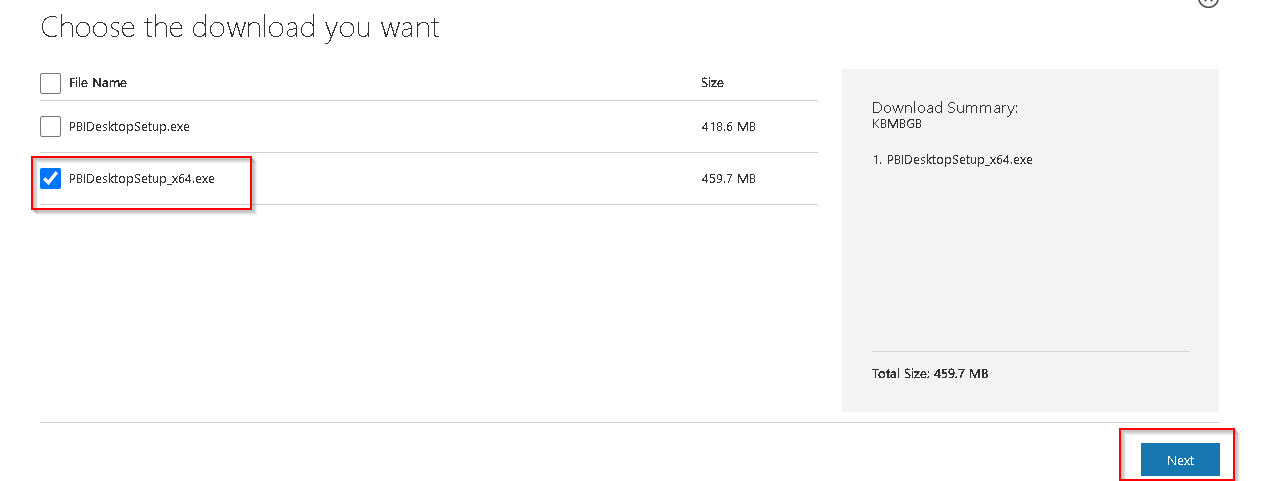
b. Click on Download.

c. Select the appropriate EXE file as per your system and Click on Next.

d. Once the .exe file is downloaded successfully then open it and complete the installation by opening it.

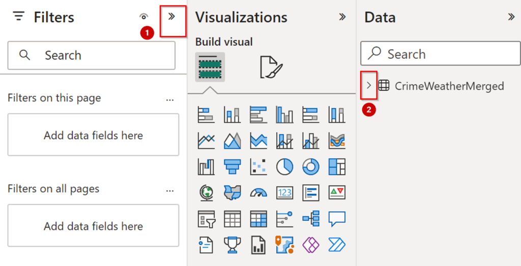
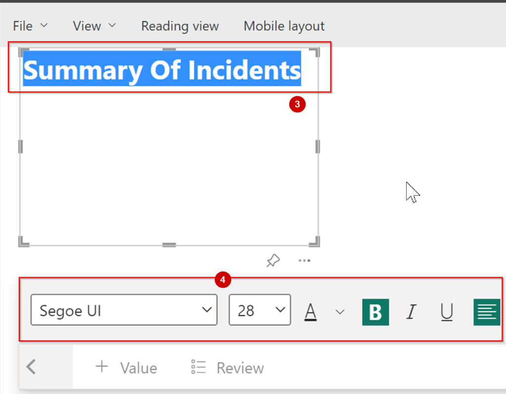
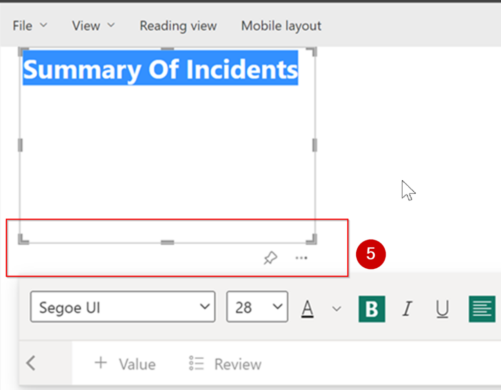
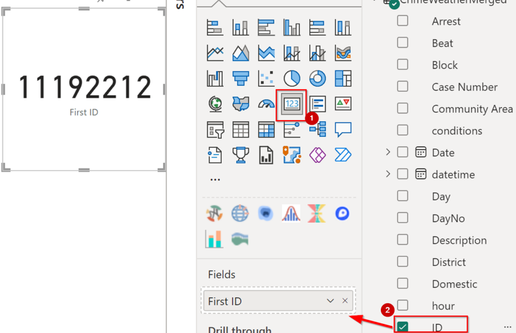
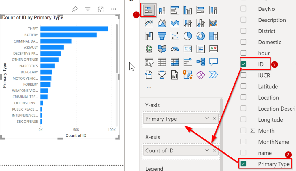
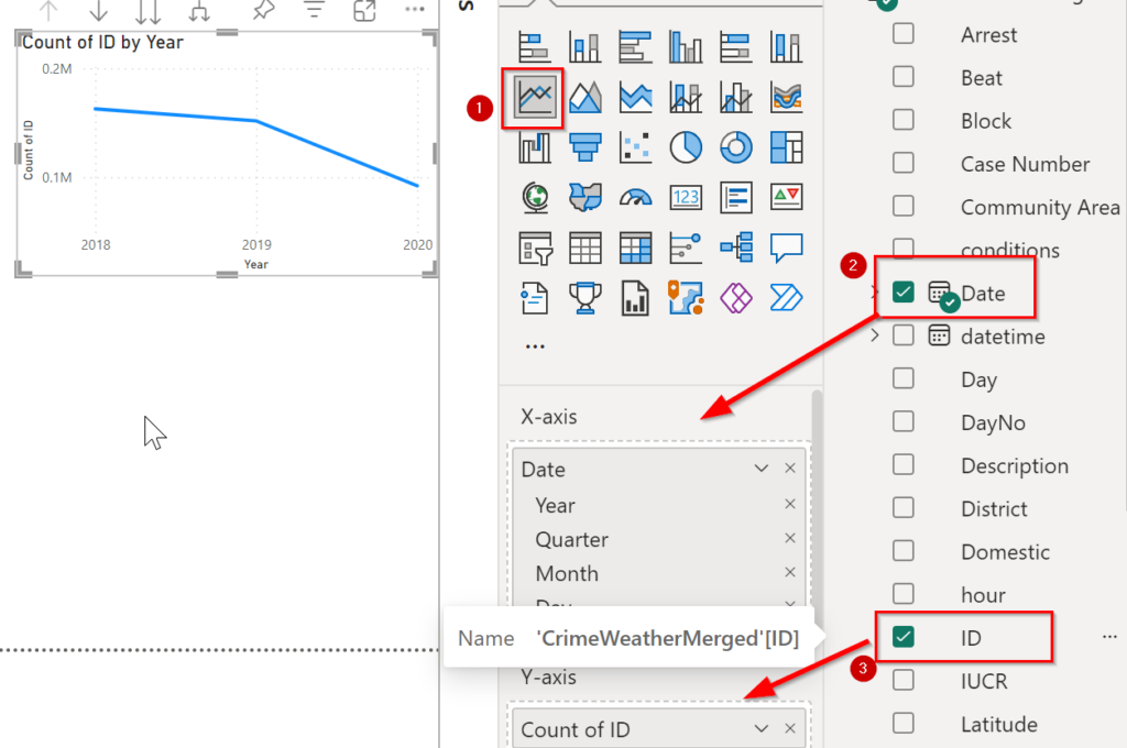
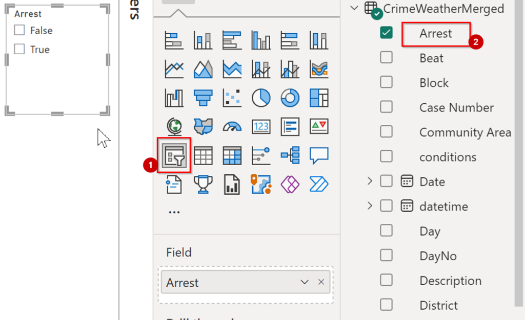
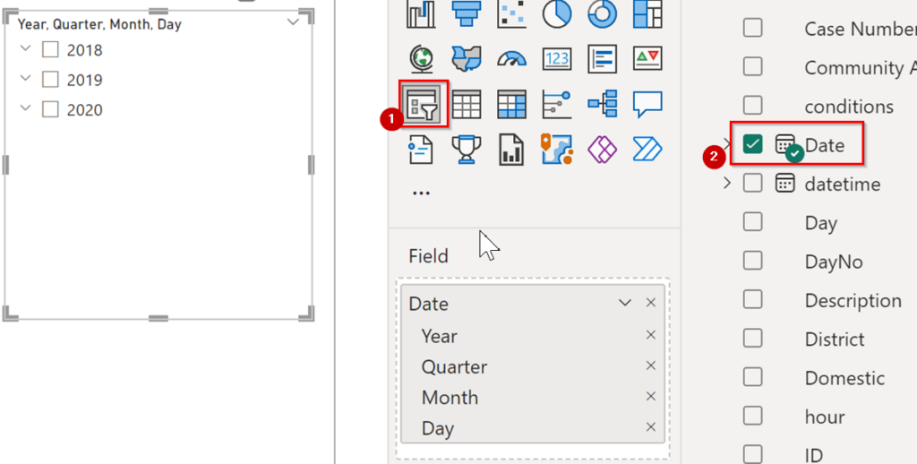
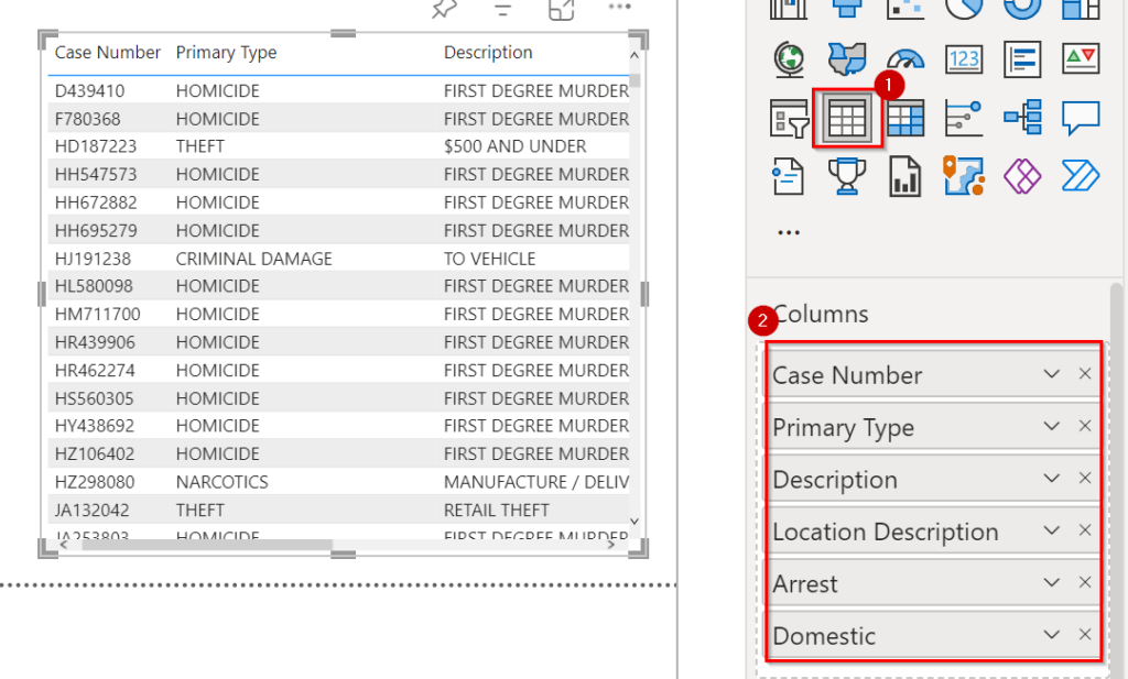
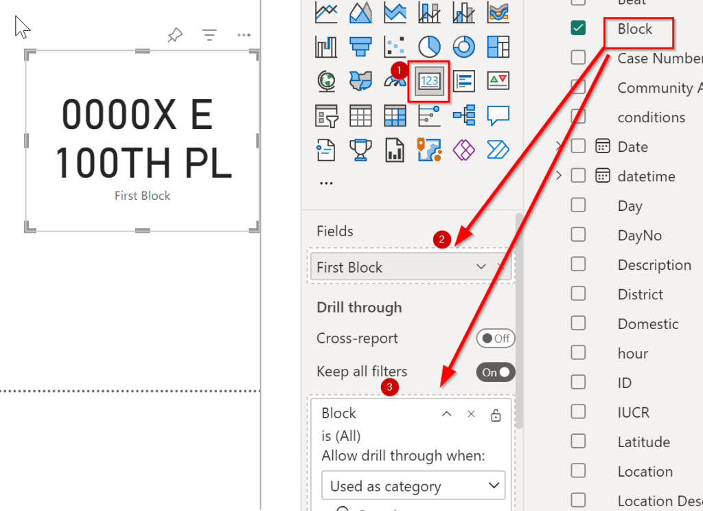
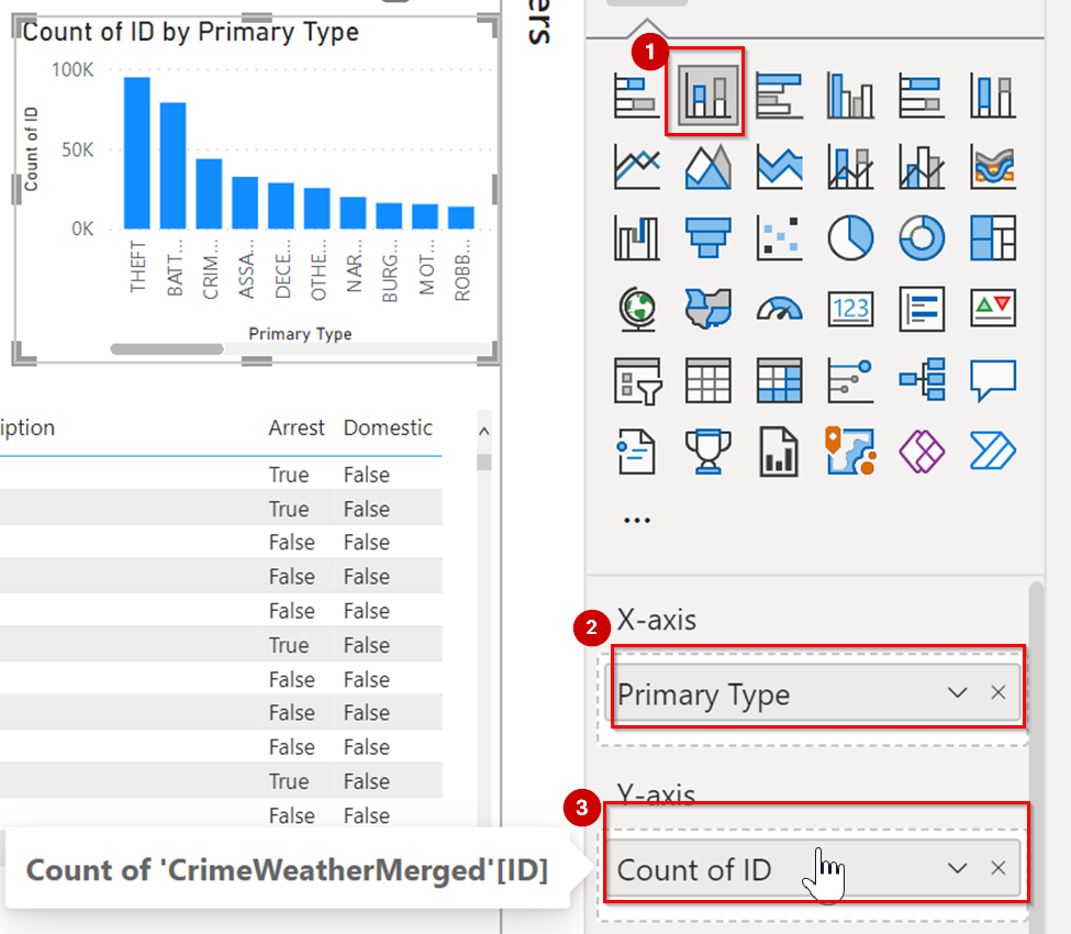
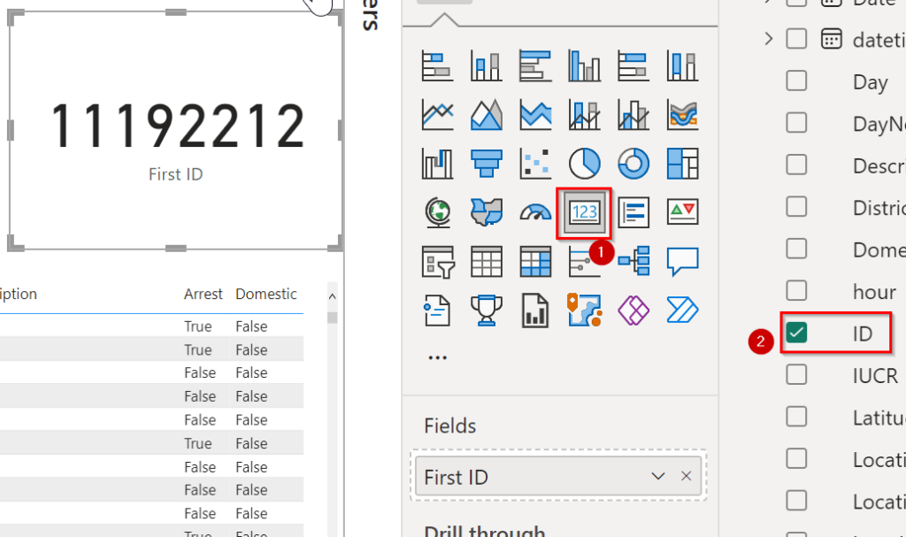
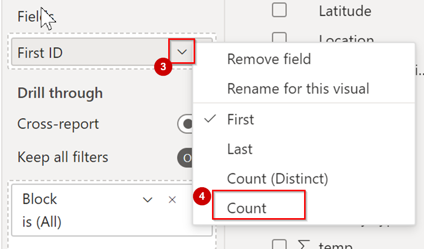
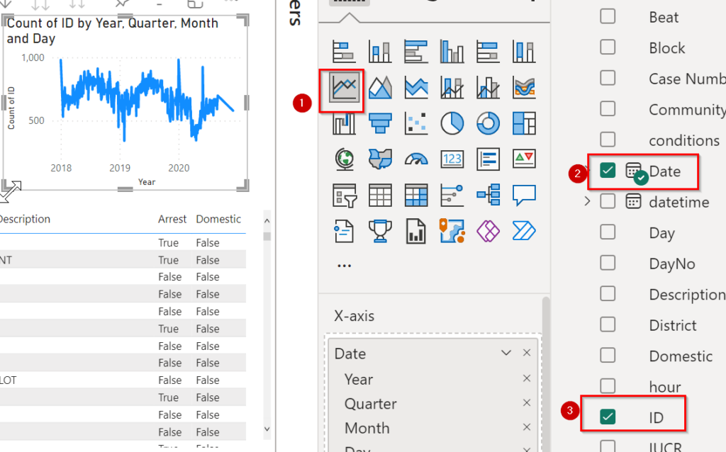
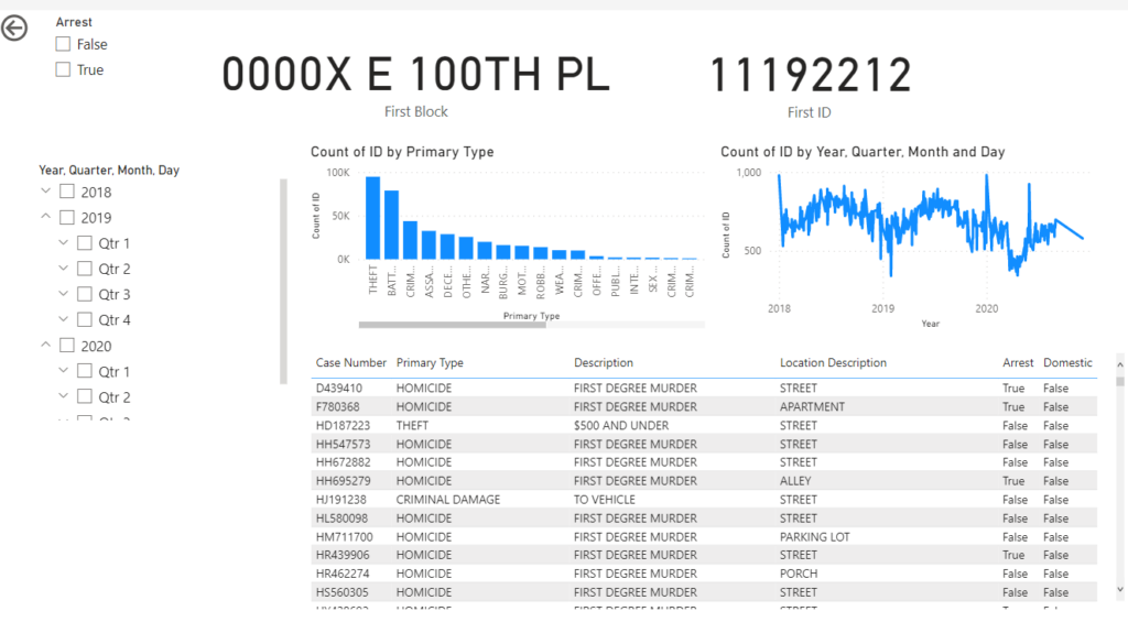
Selecting a visual you can see there is resize option on the border of visual, you can use that. Also for moving Visual from one place to another, you will see 3 dots after selection of visual, Click on that and drag your mouse by holding click continuously.

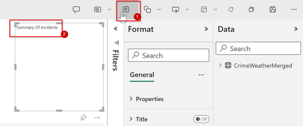
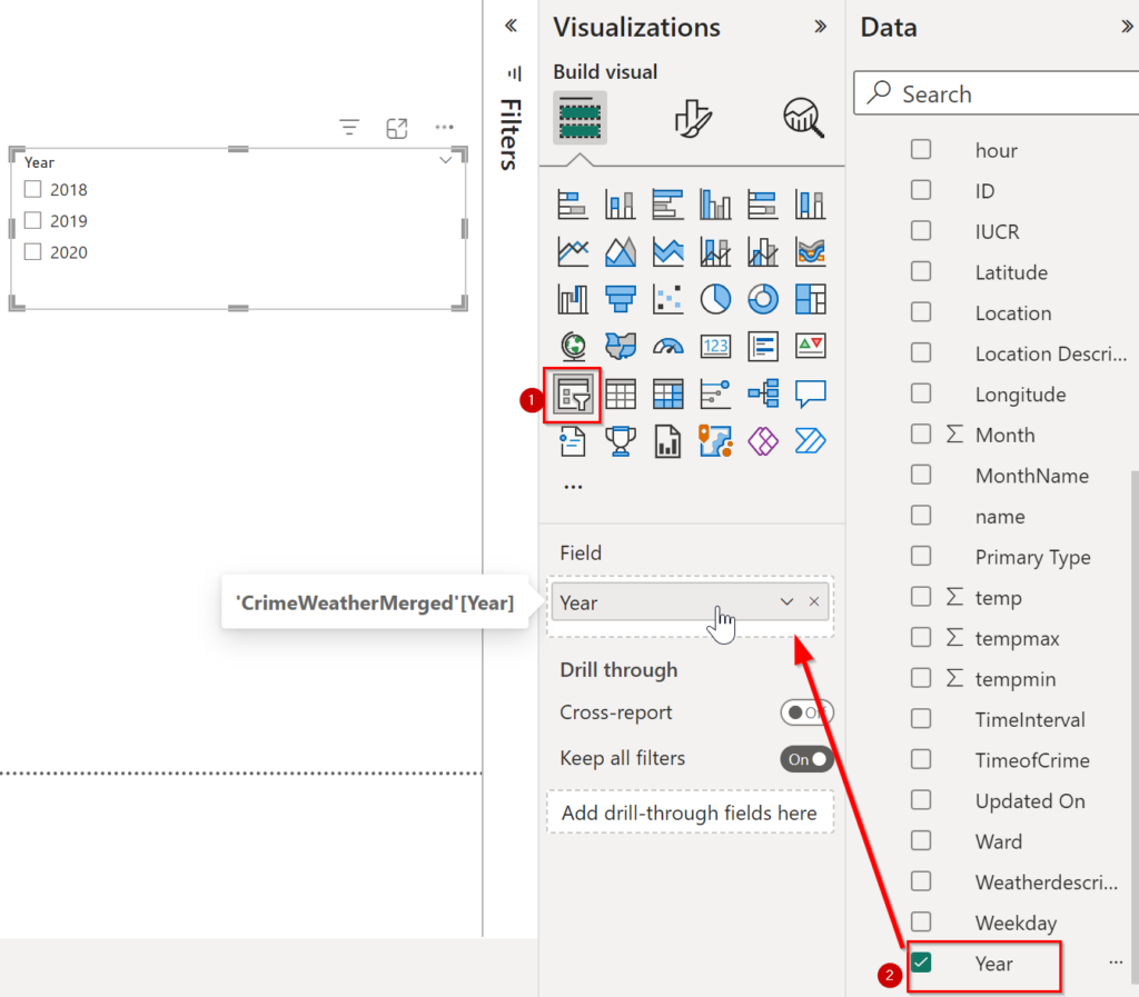
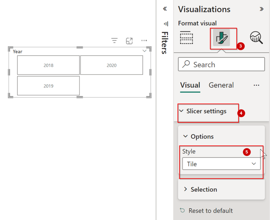
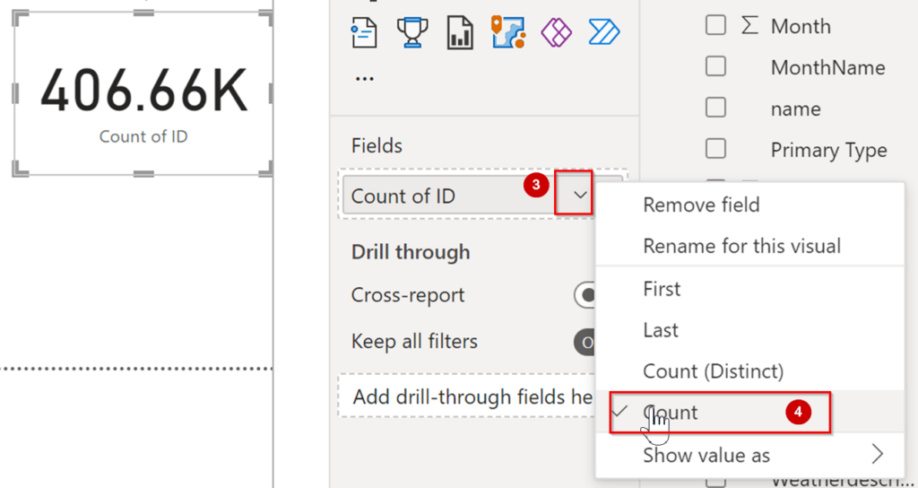
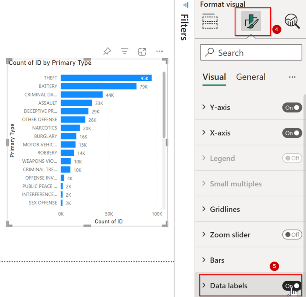
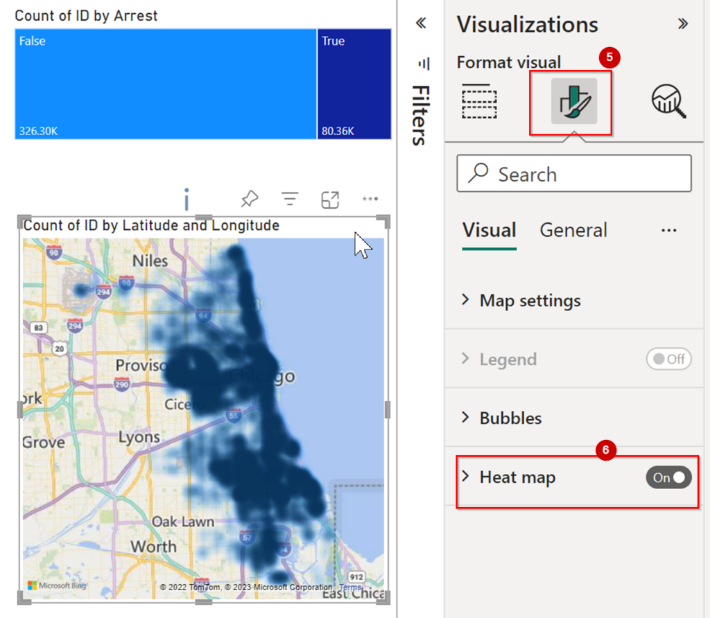
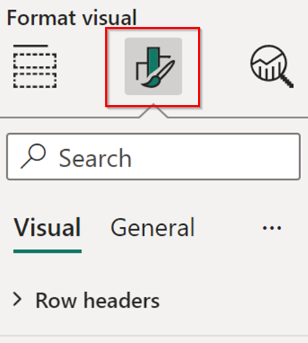
Select the visual. Then In Visualization pane 2nd Option is Format Your Visual Button. If you are not selected the visual then you will not able to see this button.

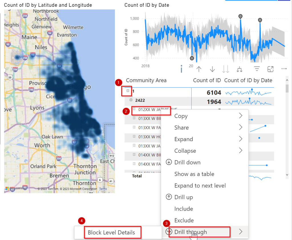
Like other tools you can use CTRL+Z for Undo

Objectives

This lab will introduce you to Power BI, a widely-used data visualization tool. We will be designing visuals that utilize the output dataset which we stored in the Azure SQL database in Lab-1.

We have Successfully Completed Lab1 with transformation of Data. In Lab2 We are going to create a Power BI Report and Visuals.

Task-1:- Login to Power BI

  1. Open Power BI in your browser in incognito mode (Google Chrome preferred)

2. Enter Username which is provided to you and Click on Submit.

3. Enter Password and Click on Sign in.

4. You might see a prompt like the one pictured below, Click on Ask Later (Note- Whenever you find this prompt click on the Ask Later option)

Now you have successfully logged in to the Power BI service and have completed Task-1 for this lab.

Task 2- Creating Power BI Visuals & Report

Section A – Connecting to Dataset.

Once you logged into the Power BI service, click on My Workspace.

You will find one report, dataset and a pbix file for reference that we have created already.

Click on Safera Report.

A Report will open, let’s talk about that.

  1. We have added the Year as a filter. Use this filter to see data according to Year.
  2. We have added a visual to show Incidents by Type. Click on each bar and see the data according to the selected type.

3. In this Visual we have added a Date in Between Filter. Use this Filter to see data between two selected dates.

4. This visual shows the Count Of Incidents as KPI

5. Here we are showing the number of Arrests among all Incidents. Click on any value to see specific related data.

  1. In this Visual We are showing the number of incidents by their location in a Heat Map.
  1. Here we are talking about anomalies. Look at the sudden spike in the visual at various points; each point indicates an anomaly. Click on any point and it will explain the anomalie.
  1. This is a Matrix Visual. Here we are showing the number of incidents by their location in a hierarchical manner. At the top level, there is Community Area, by expanding Community Area you will see the Beat and under that, there is a Block. If you will select any individual Block or Beat, the Heat Map is automatically focused on that location.

There is another page in this report Block Level Summary. On this page, we are providing all of the information about incidents at the Block level.

So Now Let’s create this report.

  1. Click on My Workspace button in bottom left.
  2. Click on more options (three dots(…))

3. Click on Create Report.

A new page will load to create reports.

  1. Click on >> icon in the Filters pane to hide it; this will give us more space to create reports for better visual experience.
  2. Expand the Table CrimeWeatherMerged on the right of the screen to see all fields.

Section B – Report / Visual Creation

Now that the data is loaded we are going to create a report.

  1. First we’ll add a title to the report.

    1. Click on Text box ( third option in Menu Bar)

    2. Add a title by typing into the text box Summary of incidents

  1. Select Title.
  2. Format Title and increase size of it and make the font Bold.

5. Adjust the position of text box, so Click and Hold three dots and move the visuals or resize visual at appropriate position.

6. Click Outside of the text box to deselect this visual. (Note : We will perform this step each time before creating a new visual; if we don’t, when we select a new visual it may apply the new type to the visual we’ve been working on and this can cause errors.)

We have successfully added a title to the report.

  1. Our Next task is to create a Year Filter.

    1. Select Slicer from Visualization Pane.
    2. Drag Year Column into Field Section.
  1. Click on Format Your Visual
  2. Click Slicer Settings.
  3. Select Style as Tile from dropdown under Options.
  4. Resize and rearrange the Year Filter.

2. We have successfully created a Year Slicer as a filter. Our Next step is to create a KPI to show the count of incidents.

  1. Select Card from the Visualization Pane.
  2. Drag ID column into the Field Section
  1. Click on the Dropdown Of First Id in Field Section.
  2. Select Count instead of First.
  3. Rearrange this KPI at proper place on the page.

3. Create a treemap to show the number of arrests.

  1. Select Treemap from Visualization Pane.
  2. Drag Arrest Column into category Section.
  3. Drag Id column into Values Section

4. Click Format Your Visual.

5. Turn On Data Labels

4. Since we are creating a summary of incidents, we can rename this page to Summary.

  1. Double Click on Page name(Page1) to rename this.
  2. Rename Page1 to Summary

5. We are going to show the number of incidents by type.

  1. Select Stacked Bar Chart from Visualization Pane.
  2. Drag Primary Type into Y-Axis.
  3. Drag Id into X-Axis

4. Click Format Your Visual.

5. Turn On Data Labels

6. Let’s create a visual to show the Count of Incidents in a map visual.

  1. Select Map from the Visualization Pane.
  2. Drag the Latitude Column into the Latitude Field Section.
  3. Drag the Longitude Column into the Longitude Field Section
  4. Drag the ID Column into the Bubble Size Section

5. Click Format Your Visual.

6. Turn On Heat Map option at bottom.

7. Let’s create a new visual which will show a count of incidents according to the date.

  1. Select the Line chart visual option from the Visualization Pane.
  2. Drag the Date Column into X-Axis.
  3. Drag the ID Column into Y-Axis

4. Click on the DropDown of Date Hierarchy in X-Axis.

5. Select Date instead of Date Hierarchy.

Note : In this visual you will see there is sudden spike that shows there could be some anomaly in the data. Let’s investigate that.

  1. Click on Add Further Analysis To Your Visual.
  2. Scroll down and Turn On Find Anomalies

Note: You will see some highlighted points in the visual; those are potential anomalies. Click those points and you will see additional information. After analysing the data Click on the Close Button In the Anomaly Pane

8. We will create a Matrix to analyze data hierarchically.

  1. Select matrix visual from the Visualization Pane.
  2. Drag these fields (Community Area, Beat, Block, Primary Type) into the Rows Data field.
  3. Drag Id Column as Count in Values Data Field.
  1. Click on the down arrow of First ID in the Values Field Section.
  2. Select Count instead of First

Note: In the Matrix visual there is a + button that is visible under Comunity Area; Expand that Community Area, under that Beat is there and by expanding Beat there is Block.
We will add sparklines into matrix visual to understand data in better way.

  1. Click on Dropdown of Count of Id.
  2. Select Add a sparkline, a new pop up will open.
  1. Select ID in Y –Axis
  2. Select Count in Summarization
  3. Click on X-Axis Dropdown, Expand table and Select Date from list of fields.
  4. Click on Create.

    Note: Wait for load the spikes as visual into matrix.
  1. Click on Format your Visual.
  2. Scroll to the bottom and expand the Sparklines option.
  3. Under Sparkline scroll down and expand the Marker Option.
  4. Select Highest in that marker option.

9. We have successfully created Summary Report. Our next task is to create a Block Level Details report.

  1. Click on + icon beside of Summary Page at bottom left side of the page.
  2. Double click on page name (Page1) to rename it and type Block Level Details as the new page name

10. Create a filter on the basis of Arrest.

  1. Select Slicer from the Visualization Pane.
  2. Drag Arrest column into the Field section.

11. Let’s Create a date filter.

  1. Select Slicer from Visualization Pane.
  2. Drag Date Column into the field section.

12. Now create a table to show block level details.

  1. Select the Table option from the visualization pane.
  2. Add all required fields(Case Number,Primary Type, Description, Location Description, Arrest, Domestic) into that by dragging fields into the column option.
  3. Resize the table visual

13. Create a Card to show the Block Name.

  1. Select Card visual from the Visualization Pane.
  2. Drag the Block Field into the Fields section.
  3. Also drag the Block field into the Drill Through Option.
    Note: We are adding Step 3 because we will select a block from the Summary page and we’ll see the information about that block in this page by drilling into the Matrix visual.

14. We will add a bar chart visual to show Count of Incidents By Type.

  1. Select the Stacked Column Chart visual from the Visualization Pane.
  2. Drag the Primary Type into X-Axis.
  3. Drag the Id in Y-Axis
  1. Click on Format Your Visual
  2. Turn On Data Labels.
  3. Resize the visual and arrange it in a way that looks good

15. Let’s Create a KPI to show the count of incidents.

  1. Select Card from the Visualization Pane
  2. Drag the ID column into Fields, again it will show first ID
  1. Click on the dropdown of ID in the Field Section.
  2. Select Count from the list, it will show Count of incidents instead of First ID.

16. We will add one more visual to see count of incident by date.

  1. Select the Line Chart option from the Visualization Pane.
  2. Drag Date into the X-Axis.
  3. Drag ID into the Y-Axis
  1. Click on the DropDown of Date in the Field Section
  2. Select Date instead of Date Hierarchy.

17. Now Save this Report.

  1. Click on File.
  2. Click Save.
  1. Add the report name as incident Summary.
  2. Click on Save

We have completed our report creation. This is a reference page that shows what we have created.

Summary

Block Level Details

Let’s analyse the report.

  1. Go to the Summary Page
  2. Analyse incident by Location, Count, Area, Date.
  3. Expand the Matrix Visual by clicking on the + sign.
  4. Right Click on any block, Select the Drill Through option, and under that Click on Block level details.
  5. It will redirect to the Block Level Details page with only details of that block which you have drilled into as a parameter.

We have completed all steps for Lab2.

END OF LAB 2 - Visualize Your Data